Brief:
Design a package for peas that presents the idea of luxury brand, taking into account dominant signifiers of "luxury" from a wide range of packaging and other visual communication examples.
Visual Landscape for Luxury:
 How is established perception of luxury?
How paradigms like surface design, structure and materials create perception of luxury?
Main packaging paradigms have significant impact on product perception.
- surface design – Luxury is presented mostly by colors as gold, silver or black. Used typeface decides as well about product perception.
- structure – Luxury "looks" simple, clear, tidy but innovative/surprising. Window or transparency in package makes it more luxury as you can see what inside and feel about the product more confident.
- materials – glass, wood, thick cardboard or even fabric as satin or silk. The material has to show precision, touching the luxury package should give impression of something special. Also weight of the package decides on product perception. It is commonly considered that heavier product is better/worthier.
CRITERIA
Luxury packaging should:
- have innovative shape but easy to use
- provide specific luxury colors as gold, silver or black
- be made from proper material (heavy, made with precision glass, metal,thick cardboard, satin)
- provide a window or be transparent
- have typeface which suggest luxury (uppercase letters)
My first idea was to make transparent plastic pea ball...
But actually it doesn't meet all luxury requirements... it is only transparent and plastic package wouldn't show its exceptionality because all current pea packages are plastic.
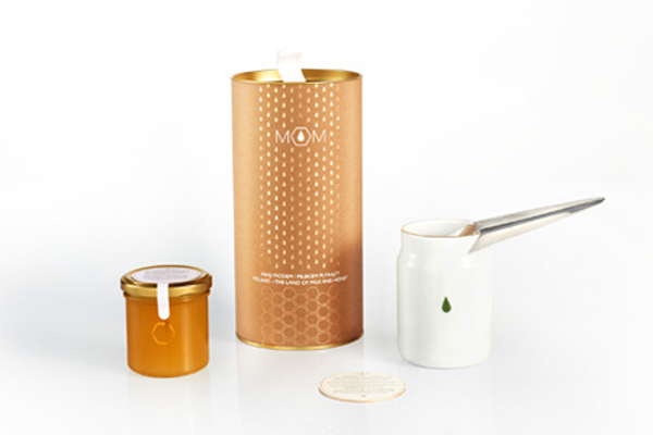
My another idea was to create a plastic can which looks like metal through surface design.
My designs don't look very real and luxury. And the costs of production would be more expensive than current plastic bag package. And we have to remember that package can not be more expensive than the product. This idea wasn't too bad considering the lid with dispenser, window in the tin and colors. I would have to work more on designs and visualization of that package to have better outcome. However I decided to move on and create something more effective and looking more luxury.
Similar surface but different shape and material. That one would be cheaper than previous one because it is just from cartoon box inside with same kind of foil like juice box.
As my designs weren't luxury enough I tried another approach...
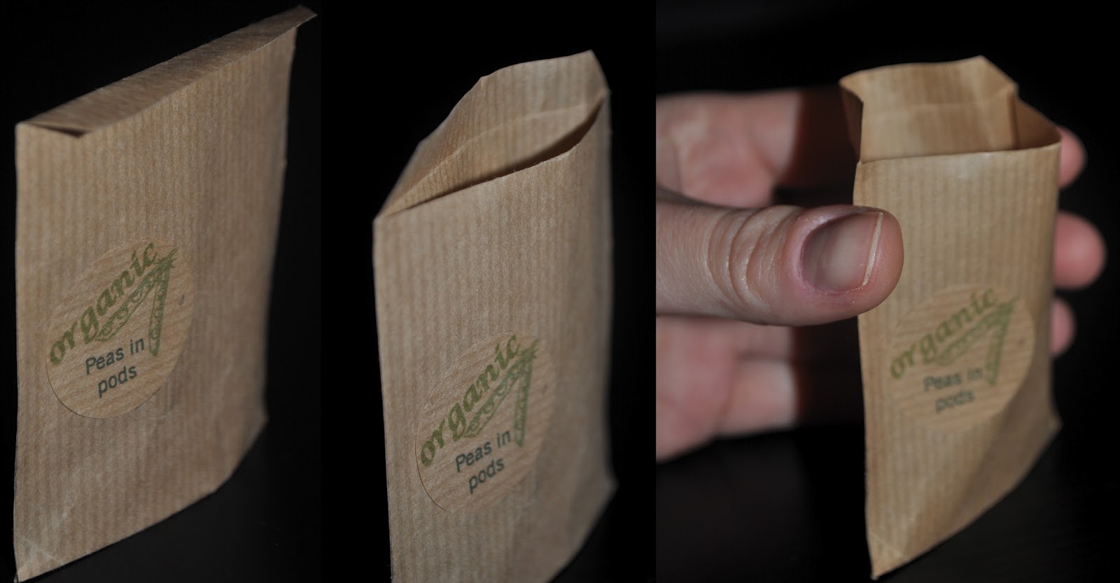
Do peas need packaging at all? The pea pod gives peas a natural packaging.
What if peas in pods will be sold in an expensive shop in a big containers/wooden boxes?
- the shop has to provide a packaging for peas in pods next to the container/box
- customer can pick the product by himself – as much he want
As peas are in pods and they are in a shop in the container they already look natural. Why don't make a package which looks natural/organic?
Nowadays naturalness is considered as better value. I came up with ideas like:
Paper bag with natural looking surface design and a natural string became as luxury as gold satin package. Luxury of the package depends on the product and current retail trend and habit and customers preferences.
Firstly I made the bag with the string then I make it more simple as it looks like envelope.
I set my criteria as the luxury packaging has to be gold or silver, shiny and be made from stable materials as glass or metal. But in this case for luxury pea pod packaging my idea met only with one of my criteria: shape easy to use. Is it enough?
I think that in my principles and paradigms I forgot to mention that nature nowadays is very luxury thing. In the beginning of the project I didn't realize/notice that naturalness plays quite significant role in product value perception.