Monday, 7 May 2012

Are children attracted by cigarettes packaging? – Shocking impact of tobacco packaging on children.

Is there any influence on children by tobacco packaging? 
My answer is yes. Especially when they see their parents smoke. The packages are very colorful with different images and color effects what can drag children attention. I would like to share a video which shows what kids think about cigarettes packaging...


The movie shows exactly the packaging affect children and it is just shocking... but actually we shouldn't be shocked because we know it is true – tobacco packaging are too fancy, trendy and colorful. In my opinion they shouldn't. Children like if something is shiny, colorful and with images. They have very powerful impact on kids. 
Taking this problem from the designer and producer side I have to sadly say that is is business and this is what producer wants. This is the main goal of every company to attract people's attention and drag as many consumer as possible. So within this criteria the packages are just great because they drag adults attention as well as children. This can predict even more consumers in the future because of the fact that kids are attracted already and will probably try to smoke in theirs future. On the other side the packaging as it is only for specific audience – in this case smoking adults, should suit their lifestyle only and should attract only that specific audience. However I think the tobacco companies don't care about it they want as many consumers as possible because it is a profit for them.

There is a case about plain cigarettes packaging. Is it fair for tobacco companies to discourage their audience by changing the packages visualization? Firstly some of the companies might bankrupt, so it is connected with that many people will lose their jobs. But secondly if nothing change we will not save our life because smoking causes many diseases. 
In my opinion our life, our population's health is the most important thing and we should all consider and accept the new plain cigarettes packaging because maybe it will help many people in the future.

The new report reviews tobacco industry documents from over the last half century as the future of tobacco packaging is being considered in a Department of Health public consultation.

My analysis is based on the article from 
Thursday 26 April 2012, Cancer Research Uk: New report and film reveal shocking impact of tobacco packaging on children [online], http://info.cancerresearchuk.org/news/archive/pressrelease/2012-04-26-new-report-and-video-reveal-impact-of-tobacco-packaging-on-children [ accessed 28 April 2012]


Wednesday, 2 May 2012

Lotao Brief

I had an opportunity to work on the brief together with one German designer- Kersten von Sohlern.
The brief was:
This summer Lotao will start with a new salt serie. We are planning to start with two types of “Flor de Sal”: one pure version, and one version with “Tiger Pepper”.  The salt is made in Indonesia, at Bali island.

Target group: High End Consumer

Working title:

  •  Bali Breeze. Fleur de Sal aus Indonesien
  •   Tiger Breeze. Fleur de Sal mit indischem Tiger-PfefferThe 

Packing we are looking for:

150g Tin/Box
Black/White Color, maybe Blue for the Pure Version, and Red(?) for the Pepper Version.

Maybe this Salt-Tins/Packages should fit to the Kiss Series – more than to the Lotao Series.

This is example of the packaging for Kiss Series. The new Salt series should be similar to this one. And also I was given the measurements of the label, so I couldn't play with the structure design much. It was more about    the graphic.


Criteria:
1. The packaging has to be connected with Kiss series.
2. Pure version of the salt-blue pepper version-red
3. It has to be for 150g of salt
4. Thera are two names:
*Bali Breeze. Fleur de Sal aus Indonesien
*Tiger Breeze. Fleur de Sal mit indischem Tiger-Pfeffer
5. It has to be for High End Consumer.
6. The packaging has to show the value and quality of the product.

I created some draft sketches of the packaging: 
These tins I made with the exact measurements I was given. I came up with wave idea as it associate with the sea and breeze. I had to make it simple. It has to be connected with the Kiss series so I was trying to do similar layout. As i had given alrady the measurements by the company I couldn't play with the structure of the package. So I stared to make the graphic design for it. 
I was trying to reach the Bali atmosphere on the package so I was using images of traditional methods for collecting the salt from the sea.
But the images were a bit too complicated so I stayed with the wave and salt. 
i think they doesn’t look bad. I replaced the real wave picture with some kind of iconic wave drawing. It looks more interesting I think and has even more power than the real photo. 
As the real Bali salt has a shape of piramid cristals I used the photograph of it. And it actually looks more interesting than the normal salt. However there wuld be a problem I think because most peaople will not know what is this. 
For the pepper version I made the wave shape in red and for the salt I added some pepper.
In the last I removed the black stripe and in my opinion doesn’t look bad. The whole image for me looks like sea food or something which is connected with sea and that’s the point for this project.

The brief doesn't say anything about structure but I wanted to make it long to look more classy. The volume of the package is the same as the first ones I just made the a bit taller and thinner. I think with the shape like this they would stand out form the shop shelfs.


Why visualization of the product is so important?

Showing your project to your customer it has to present high and professional level of your project. The best visualization way is concept board. I would like to give you some tips and guides for good concept board:
1. It has to be clear and understandable
2. It should show the object in few different angles of view
3. It should show the scale of the object
4. It has to have some inscription about the object.
5. It can include some sketches and ideas

It is very important to show designed product in the best way because from that depends if the project will be accepted by the customer or not. The object you are presenting on the board has to look professional, real and photographic.
Above I placed some examples of my visual concept boards. Maybe they aren't the best but I tried to meet all criteria I have set. I think showing the object from many different angles is quite significant because it shows clearly how it looks and the images like that explains everything without using any text.

Please give me some feedback. Do I meet the criteria or not? Can you judge/evaluate my concept bards?

Tuesday, 1 May 2012

Ergonomics... why it is important in packaging design?


What is Ergonomics?
Ergonomics it’s about combining the science of the human body with
design to create products that look great, perform flawlessly, and fit
perfectly. It’s about fitting the users’ physical, cognitive, and emotional
needs. It may be defined as the application of scientific informations
concerning human beings to the problem of design. Ergonomics
require some kind of evidence that a satisfactory match between
product and user has been achieved.


The most important function of ergonomics in packaging design is
physical and psychological relationship between objects and the
people who use them. User has to interact with the equipment in
healthy, comfortable, and efficient manner.
Ergonomics is to make the usage of the given
product easier, more comfortable and clearer to understand.


“When simple things need pictures, labels, or
instructions, the design has failed.”
Donald A. Norman (2000,p.9)

I believe that Norman’s sentence is based on ergonomic regulations.
If the science of everyday life doesn’t communicate with the user as it
should, or directing him in wrong way I can assume the design wasn’t
ergonomically created.
I have to present the term of affordance as it refers to the perceived
and actual properties of the thing. Those fundamental properties
determine how the thing could possibly be used.
Each object has some affordances. They provide some clues to the
operation of things. For example knobs are for turning, balls are for
throwing or bouncing, glass is for seeing through and for breaking,
doors are for opening, closing and going through, etc. When the
affordances are taken advantage of, the user knows what to do just by
looking.
Affordance refers to what an object invites us to do.
However the design of the product or its packaging has to be clear that
invites the user whatever action is most sustainable and appropriate. If
you want people to carry out a specific action with a packaging, do not
rely on instruction, however clear and obvious they might be.
There are two main considerations in the design of a physical object,
its form or shape and the ergonomics of that form. The form is what
the object looks like and the story that this tells, while its ergonomics
consist of how it is designed in order to maximise user efficiency and
reduce strain.

To achieve the point above we need to familiarize with the subject of anthropometric. It is I suppose one of the most important branches of ergonomics. Anthropometric deals with body size, shape and strength. ‘Anthropo’ means ‘human’ and‘metrics’ means ‘measurements’. A general rule of ergonomics seeks to achieve the greatest possible level of comfort (or other satisfaction) for the greatest possible number of users. That’s why anthropometric is so important. To create a good design we have to know measurements of human body or just part of it. For example designing packaging for jewelry probably we need to know average measurements of the human hand.


I think for packaging ergonomics the most important part of humans 
body is a hand. Our hands interact with every packaging, we touch ,
carry, hold, open, close and grab it by our hands. Anthropometry in
case of packaging design concentrates mainly on hand measurements 
and capabilities. Through ergonomic design process the measurement 
should be taken for consideration as well as the hand movements and 
positions in particular actions.


Principles of Ergonomics in packaging design:

1. Reduce extensive force.  
Excessive force on your joints can create a potenti al for fati gue and
injury. In practical terms, the ergonomic design is to identi fy specific
instances of excessive force and think of/come across with idea/ ways
to make improvements.


2. Minimize fatigue and static load.
Holding the same position for a period of time is known as static
load. It creates fatigue and discomfort and can interfere with work.
Ergonomics deal with that to create packaging solutions witch would
be more comfortable to don’t force your muscles or joints.


3. Suitable size of the package.
The packaging has to suit your hand. In this case anthropometric will
have a significant role to adapt the packaging handle to the average
person or specific audience hand. But also size of the package has to
be suitable for the products. The package has to be designed to create
unity together with the product.


3a. Appropriate Weight of the packaging according to audience and the product.
The packaging shouldn’t be heavier than the product, but only in some
cases as for example beer crate. Because the product is heavy (24
beer bottles) the crate shouldn’t be heavier then it. It will be heavy
anyway so the packaging-crate has to be the lightest as it can (plastic,
cardboard).


3b. Proper Height and Width of the package suitable for product and audience.
The packaging should be appropriate for human size/audience size. If
it is something which is the size of the hand it should be designed to
hold it easy. It can not be very high or long unless it meets
requirements for easy to use.


4. Comfortable, stable, good structural and simple shape.
Shape has significant role as well. The shape give us the ability to
hold or carry the product stable. Here as well the designers should be
based on anthropometric and narrowly the measurement of humans
hand as most packaging we hold, open, carry, by our hands. The
product/packaging has to be easy to use-show easily its affordances
without any instructions.


5. Easy to read Color contrast.
It seems to be not really coherent with the science of ergonomics, but
actually color is also important. Ergonomics is about making the life
easier. It is the art of design which deals with all bad, uncomfortable,
difficult to use products. It is important to provide significant contrast
between type and its background.


6. Font easy to read.
The same thing is with the text on the packaging. It has to be easy to
read, simple otherwise it won’t be ergonomic as we will not be able
to read it.


My research is based mainly on books:


  1. Norman A. D. (2000) The Desogn of Everyday Things, New York: Basic Book
  2. Pheasant S. (1999) Bodyspace - Antropometry, Ergonomics and the Design of Work, London: Taylor&Francis
  3. Pheasant S. (1987) Bodyspace - Ergonomics-standards and guidelines for designers, Suffolk: British Standards Institution

How to engage with customers?


I think this drink packaging is a very good example of engaging and innovative packaging, which attracts people its surface design. It shows natural and architectonic beauties, and the joy and festivities of the people.

Pierini Partners designed a special edition for Brahma, enhancing the best aspects of the Argentinean Northeast:

  • a woman's smile (kindness and warmness),
  • a fish (fishing richness and entertaining activities),
  • a toucan (as a symbol of beautiful landscape and its singular and attractive fauna)
The composition of the surface design is very dynamic and in the same way exciting because of the bright colors and curvy shapes connected with anti-curved lines. All these aspects make the design interesting for kids as well as for adults.
Monday, 30 April 2012

Upcoming events & conferences in May


  • May 2 - 3, 2012 
  • SouthPack: Charlotte Convention Center, Charlotte, NC
  • May 15 - 18, 2012 
  • HisPack 2012: Gran Via Venue, Barcelona, Spain
  • May 22 - 24, 2012
  • East Pack: Pennsylvania Convention Center, Philadelphia, PA

The Dieline Package Design Conference!!!!!!!!!!


Today is the last day for Early Bird Rate!!! Last day to save  $170!


The conference will be in June 21-25 2012 in Boston.

It will be focused on packaging design practitioners and their work, innovations, ideas and industry. This event can bring you many inspirations especially for young packaging designers who can get some advice and help form Dan Formosa, Yael Miller, Steve Cullen and more. hat's the most important you can make new contacts- valuable contacts with other packaging designers! You can discover new ways to create great work!

I wish to go there... 

Have you heard about Smart LId?

“Our European expansion continues with the planned introduction of the Smart Lid into the first Scandinavian country”, said Nick Bayss, inventor and Managing Director of Smart Lid Systems. 
In my opinion that lid is a great idea! Business people are always in the rush and they drink their coffee on the go-in the car, bus, train or walking. The inventor spend his life growing up in his parents’ coffee shops, and running his own coffee shops for the last 15 years. And he noticed that there are two ways people got burned with hot coffee.  “The first is that they underestimated the temperature of the coffee. The second, and probably the greatest cause of serious scalding, was when the lid was not put on the takeaway cup correctly.” this is really true. His safe lid changes color when the liquid inside is very hot but also when it isn't correctly placed on the cup. There are many colors of the lid and it changes always from dark to lighter color to aware consumer about the temperature of the drink.


The lid seems to be very useful and helpful. It has great function and also makes the packaging interesting and engaging with consumers.

Wednesday, 22 February 2012

How to beat current Egg Packaging?

Brief:
Design a new egg packaging which will be so successful as current one. Is it possible?

Considerations:

  • egg – very delicate, cheap product
  • package has to be cheap
  • materials as cardboard, foam, recycled paper etc.
  • the package has to protect eggs
  • minimum number of eggs in package – 4
  • easy to cary, store, and transport
There are many new packages for eggs but manufactures
still use the same one. There is no so safe, so cheap
and so good packaging than the current one.
Is there better way to create a better one?


I decided to use corrugated cardboard – it's cheap, quite protective

 This package you can fold while carrying. 
Folding provides additional protection.
This packaging is also easy to store and transport
– hanging it one by one.


Horizontal approach is also functional. Folding the package provides additional protection as well and it creates easy to cary tube.

 
 This project showed how functional can be just corrugated cardboard. I came up with my designs quite quickly.Then I started to think how make it more functional. I considered carrying and egg protection. I measured space between eggs to make the best resistance for my packaging. I considered also storage and transport. My egg packaging is easy to store or transport – it can be just hang on some kind of wire or thin pipe. Storing packaging one by one gives additional protection for eggs. 


Tuesday, 21 February 2012

How to apply Perception of Luxury for everyday products?

Brief:
Design a package for peas that presents the idea of luxury brand, taking into account dominant signifiers of "luxury" from a wide range of packaging and other visual communication examples.


Visual Landscape for Luxury:


How is established perception of luxury?
How paradigms like surface design, structure and materials create perception of luxury?


Main packaging paradigms have significant impact on product perception. 
  1. surface design – Luxury is presented mostly by colors as gold, silver or black. Used typeface decides as well about product perception.
  2. structure – Luxury "looks" simple, clear, tidy but innovative/surprising. Window or transparency in package makes it more luxury as you can see what inside and feel about the product more confident.
  3. materials – glass, wood, thick cardboard or even fabric as satin or silk. The material has to show precision, touching the luxury package should give impression of something special. Also weight of the package decides on product perception. It is commonly considered that heavier product is better/worthier.
CRITERIA
Luxury packaging should:
  • have innovative shape but easy to use
  • provide specific luxury colors as gold, silver or black
  • be made from proper material (heavy, made with precision glass, metal,thick cardboard, satin)
  • provide a window or be transparent
  • have typeface which suggest luxury (uppercase letters)
My first idea was to make transparent plastic pea ball...

But actually it doesn't meet all luxury requirements... it is only transparent and plastic package wouldn't show its exceptionality because all current pea packages are plastic.


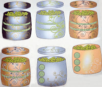
My another idea was to create a plastic can which looks like metal through surface design.
My designs don't look very real and luxury. And the costs of production would be more expensive than current plastic bag package. And we have to remember that package can not be more expensive than the product. This idea wasn't too bad considering the lid with dispenser, window in the tin and colors. I would have to work more on designs and visualization of that package to have better outcome. However I decided to move on and create something more effective and looking more luxury.


Similar surface but different shape and material. That one would be cheaper than previous one because it is just from cartoon box inside with same kind of foil like juice box.


As my designs weren't luxury enough I tried another approach...
Do peas need packaging at all? The pea pod gives peas a natural packaging.
What if peas in pods will be sold in an expensive shop in a big containers/wooden boxes?
  • the shop has to provide a packaging for peas in pods next to the container/box
  • customer can pick the product by himself – as much he want 
As peas are in pods and they are in a shop in the container they already look natural. Why don't make a package which looks natural/organic? 
Nowadays naturalness is considered as better value. I came up with ideas like: 


Paper bag with natural looking surface design and a natural string became as luxury as gold satin package. Luxury of the package depends on the product and current retail trend and habit and customers preferences.
Firstly I made the bag with the string then I make it more simple as it looks like envelope.
I set my criteria as the luxury packaging has to be gold or silver, shiny and be made from stable materials as glass or metal. But in this case for luxury pea pod packaging my idea met only with one of my criteria: shape easy to use. Is it enough?
I think that in my principles and paradigms I forgot to mention that nature nowadays is very luxury thing.  In the beginning of the project I didn't realize/notice that naturalness plays quite significant role in product value perception.