Showing posts with label my work. Show all posts

Wednesday, 2 May 2012

Lotao Brief

I had an opportunity to work on the brief together with one German designer- Kersten von Sohlern.
The brief was:
This summer Lotao will start with a new salt serie. We are planning to start with two types of “Flor de Sal”: one pure version, and one version with “Tiger Pepper”.  The salt is made in Indonesia, at Bali island.

Target group: High End Consumer

Working title:

  •  Bali Breeze. Fleur de Sal aus Indonesien
  •   Tiger Breeze. Fleur de Sal mit indischem Tiger-PfefferThe 

Packing we are looking for:

150g Tin/Box
Black/White Color, maybe Blue for the Pure Version, and Red(?) for the Pepper Version.

Maybe this Salt-Tins/Packages should fit to the Kiss Series – more than to the Lotao Series.

This is example of the packaging for Kiss Series. The new Salt series should be similar to this one. And also I was given the measurements of the label, so I couldn't play with the structure design much. It was more about    the graphic.


Criteria:
1. The packaging has to be connected with Kiss series.
2. Pure version of the salt-blue pepper version-red
3. It has to be for 150g of salt
4. Thera are two names:
*Bali Breeze. Fleur de Sal aus Indonesien
*Tiger Breeze. Fleur de Sal mit indischem Tiger-Pfeffer
5. It has to be for High End Consumer.
6. The packaging has to show the value and quality of the product.

I created some draft sketches of the packaging: 
These tins I made with the exact measurements I was given. I came up with wave idea as it associate with the sea and breeze. I had to make it simple. It has to be connected with the Kiss series so I was trying to do similar layout. As i had given alrady the measurements by the company I couldn't play with the structure of the package. So I stared to make the graphic design for it. 
I was trying to reach the Bali atmosphere on the package so I was using images of traditional methods for collecting the salt from the sea.
But the images were a bit too complicated so I stayed with the wave and salt. 
i think they doesn’t look bad. I replaced the real wave picture with some kind of iconic wave drawing. It looks more interesting I think and has even more power than the real photo. 
As the real Bali salt has a shape of piramid cristals I used the photograph of it. And it actually looks more interesting than the normal salt. However there wuld be a problem I think because most peaople will not know what is this. 
For the pepper version I made the wave shape in red and for the salt I added some pepper.
In the last I removed the black stripe and in my opinion doesn’t look bad. The whole image for me looks like sea food or something which is connected with sea and that’s the point for this project.

The brief doesn't say anything about structure but I wanted to make it long to look more classy. The volume of the package is the same as the first ones I just made the a bit taller and thinner. I think with the shape like this they would stand out form the shop shelfs.


Why visualization of the product is so important?

Showing your project to your customer it has to present high and professional level of your project. The best visualization way is concept board. I would like to give you some tips and guides for good concept board:
1. It has to be clear and understandable
2. It should show the object in few different angles of view
3. It should show the scale of the object
4. It has to have some inscription about the object.
5. It can include some sketches and ideas

It is very important to show designed product in the best way because from that depends if the project will be accepted by the customer or not. The object you are presenting on the board has to look professional, real and photographic.
Above I placed some examples of my visual concept boards. Maybe they aren't the best but I tried to meet all criteria I have set. I think showing the object from many different angles is quite significant because it shows clearly how it looks and the images like that explains everything without using any text.

Please give me some feedback. Do I meet the criteria or not? Can you judge/evaluate my concept bards?

Wednesday, 22 February 2012

How to beat current Egg Packaging?

Brief:
Design a new egg packaging which will be so successful as current one. Is it possible?

Considerations:

  • egg – very delicate, cheap product
  • package has to be cheap
  • materials as cardboard, foam, recycled paper etc.
  • the package has to protect eggs
  • minimum number of eggs in package – 4
  • easy to cary, store, and transport
There are many new packages for eggs but manufactures
still use the same one. There is no so safe, so cheap
and so good packaging than the current one.
Is there better way to create a better one?


I decided to use corrugated cardboard – it's cheap, quite protective

 This package you can fold while carrying. 
Folding provides additional protection.
This packaging is also easy to store and transport
– hanging it one by one.


Horizontal approach is also functional. Folding the package provides additional protection as well and it creates easy to cary tube.

 
 This project showed how functional can be just corrugated cardboard. I came up with my designs quite quickly.Then I started to think how make it more functional. I considered carrying and egg protection. I measured space between eggs to make the best resistance for my packaging. I considered also storage and transport. My egg packaging is easy to store or transport – it can be just hang on some kind of wire or thin pipe. Storing packaging one by one gives additional protection for eggs. 


Tuesday, 21 February 2012

How to apply Perception of Luxury for everyday products?

Brief:
Design a package for peas that presents the idea of luxury brand, taking into account dominant signifiers of "luxury" from a wide range of packaging and other visual communication examples.


Visual Landscape for Luxury:


How is established perception of luxury?
How paradigms like surface design, structure and materials create perception of luxury?


Main packaging paradigms have significant impact on product perception. 
  1. surface design – Luxury is presented mostly by colors as gold, silver or black. Used typeface decides as well about product perception.
  2. structure – Luxury "looks" simple, clear, tidy but innovative/surprising. Window or transparency in package makes it more luxury as you can see what inside and feel about the product more confident.
  3. materials – glass, wood, thick cardboard or even fabric as satin or silk. The material has to show precision, touching the luxury package should give impression of something special. Also weight of the package decides on product perception. It is commonly considered that heavier product is better/worthier.
CRITERIA
Luxury packaging should:
  • have innovative shape but easy to use
  • provide specific luxury colors as gold, silver or black
  • be made from proper material (heavy, made with precision glass, metal,thick cardboard, satin)
  • provide a window or be transparent
  • have typeface which suggest luxury (uppercase letters)
My first idea was to make transparent plastic pea ball...

But actually it doesn't meet all luxury requirements... it is only transparent and plastic package wouldn't show its exceptionality because all current pea packages are plastic.


My another idea was to create a plastic can which looks like metal through surface design.
My designs don't look very real and luxury. And the costs of production would be more expensive than current plastic bag package. And we have to remember that package can not be more expensive than the product. This idea wasn't too bad considering the lid with dispenser, window in the tin and colors. I would have to work more on designs and visualization of that package to have better outcome. However I decided to move on and create something more effective and looking more luxury.


Similar surface but different shape and material. That one would be cheaper than previous one because it is just from cartoon box inside with same kind of foil like juice box.


As my designs weren't luxury enough I tried another approach...
Do peas need packaging at all? The pea pod gives peas a natural packaging.
What if peas in pods will be sold in an expensive shop in a big containers/wooden boxes?
  • the shop has to provide a packaging for peas in pods next to the container/box
  • customer can pick the product by himself – as much he want 
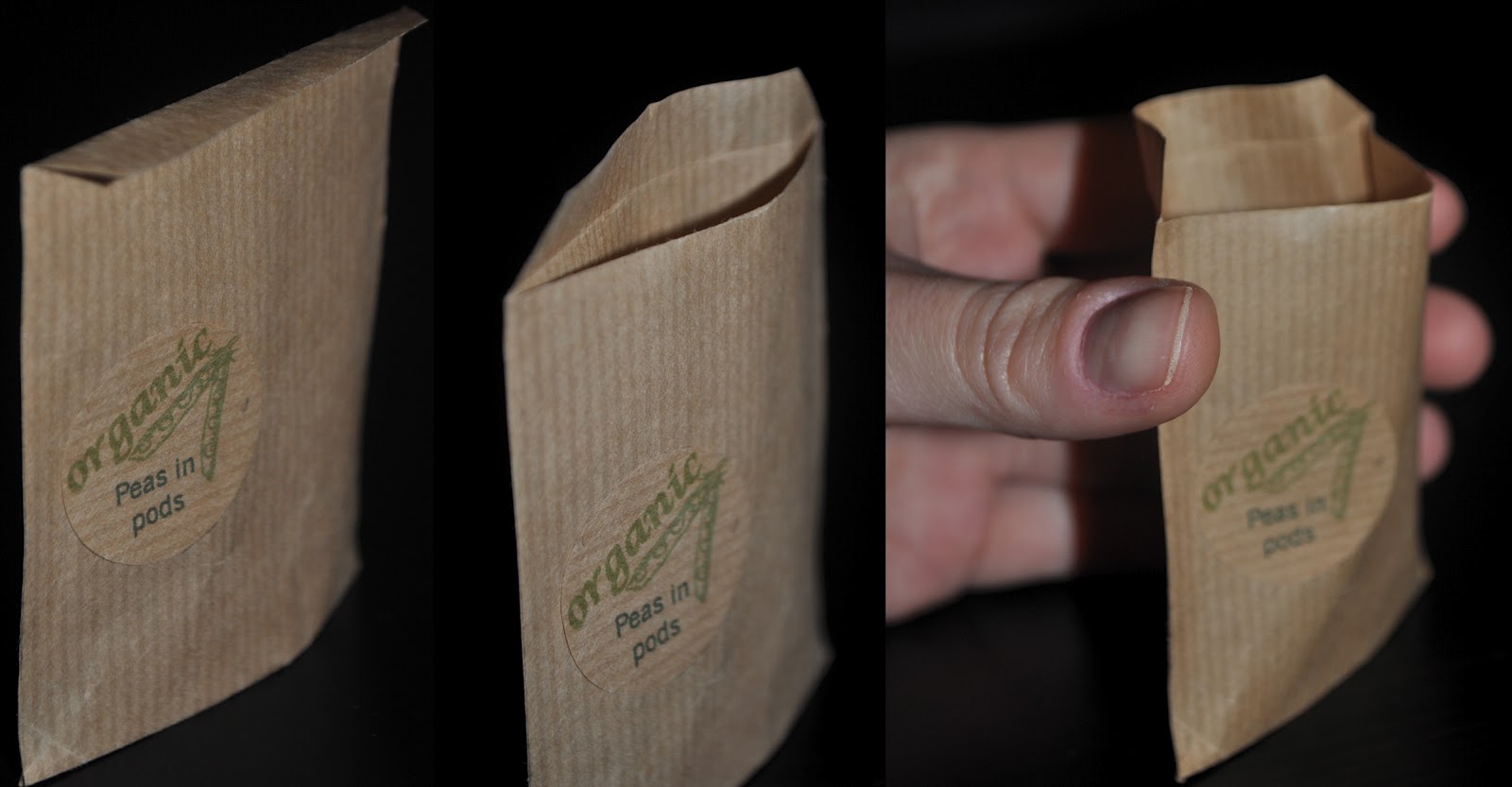
As peas are in pods and they are in a shop in the container they already look natural. Why don't make a package which looks natural/organic? 
Nowadays naturalness is considered as better value. I came up with ideas like: 


Paper bag with natural looking surface design and a natural string became as luxury as gold satin package. Luxury of the package depends on the product and current retail trend and habit and customers preferences.
Firstly I made the bag with the string then I make it more simple as it looks like envelope.
I set my criteria as the luxury packaging has to be gold or silver, shiny and be made from stable materials as glass or metal. But in this case for luxury pea pod packaging my idea met only with one of my criteria: shape easy to use. Is it enough?
I think that in my principles and paradigms I forgot to mention that nature nowadays is very luxury thing.  In the beginning of the project I didn't realize/notice that naturalness plays quite significant role in product value perception.